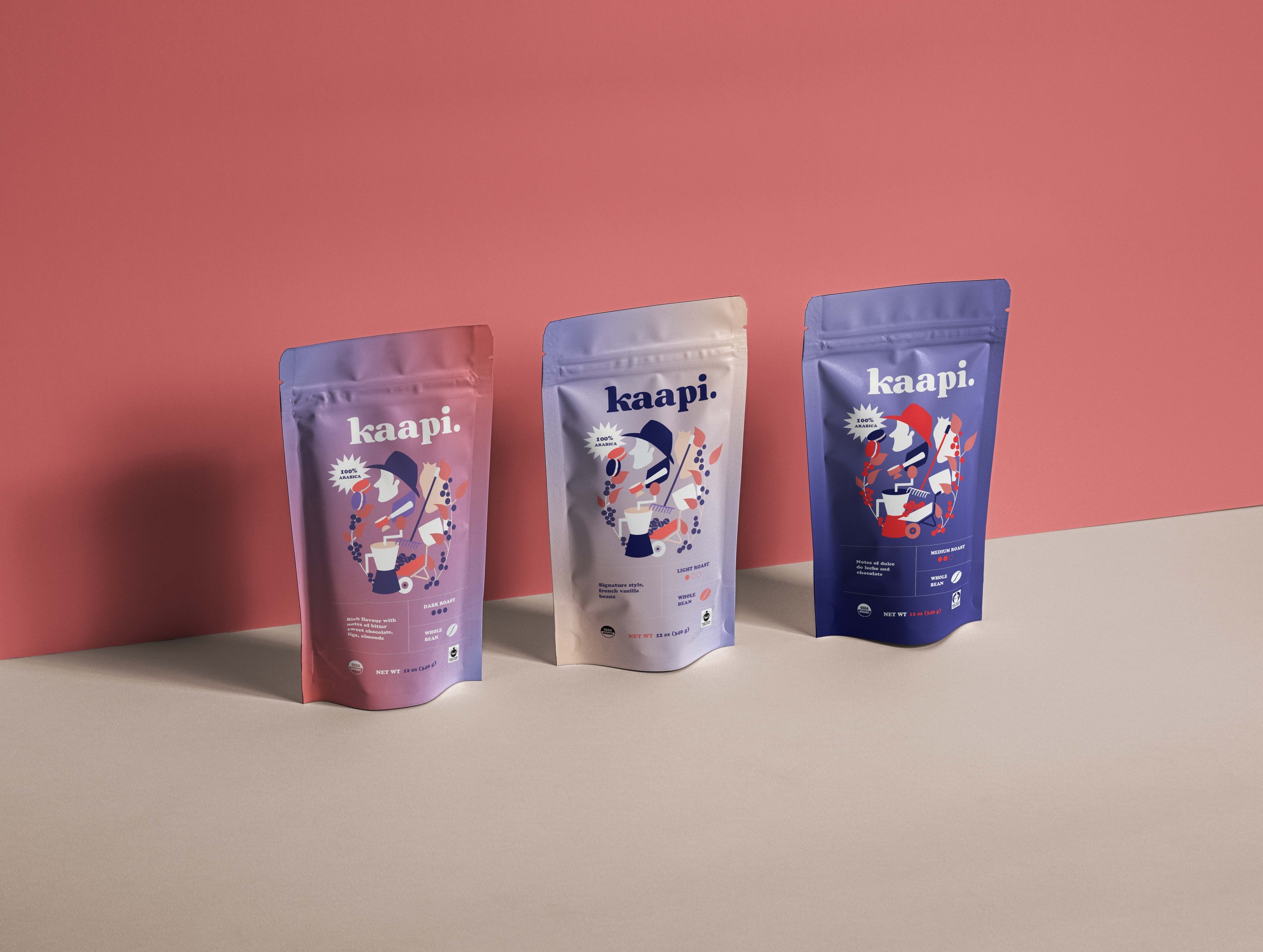
Branding & Packaging for Kaapi
Kaapi is a humble, ethically sourced coffee roasters with a mission to bring good tasting coffee to people across the world.
The name Kaapi (translating to Coffee in English) and the brand's philosophy became the starting point for me to develop a visual identity. Kaapi is not just about coffee, it is about the experience. One of the key aspirations of Kaapi is to be a humble and reliable source where each cup of coffee is not just a beverage, but a reminder that small things matter.
The packaging for the whole bean packs are Polyethylene terephthalate commonly abbreviated as PET which is ecofriendly and recyclable, therefore reducing the carbon footprint.


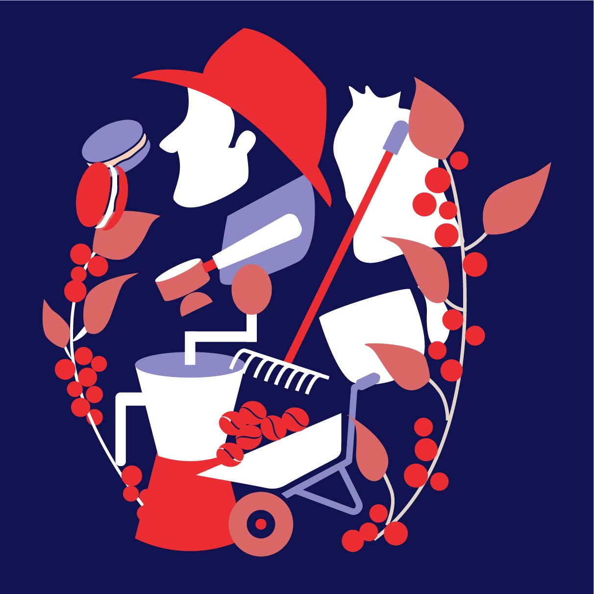
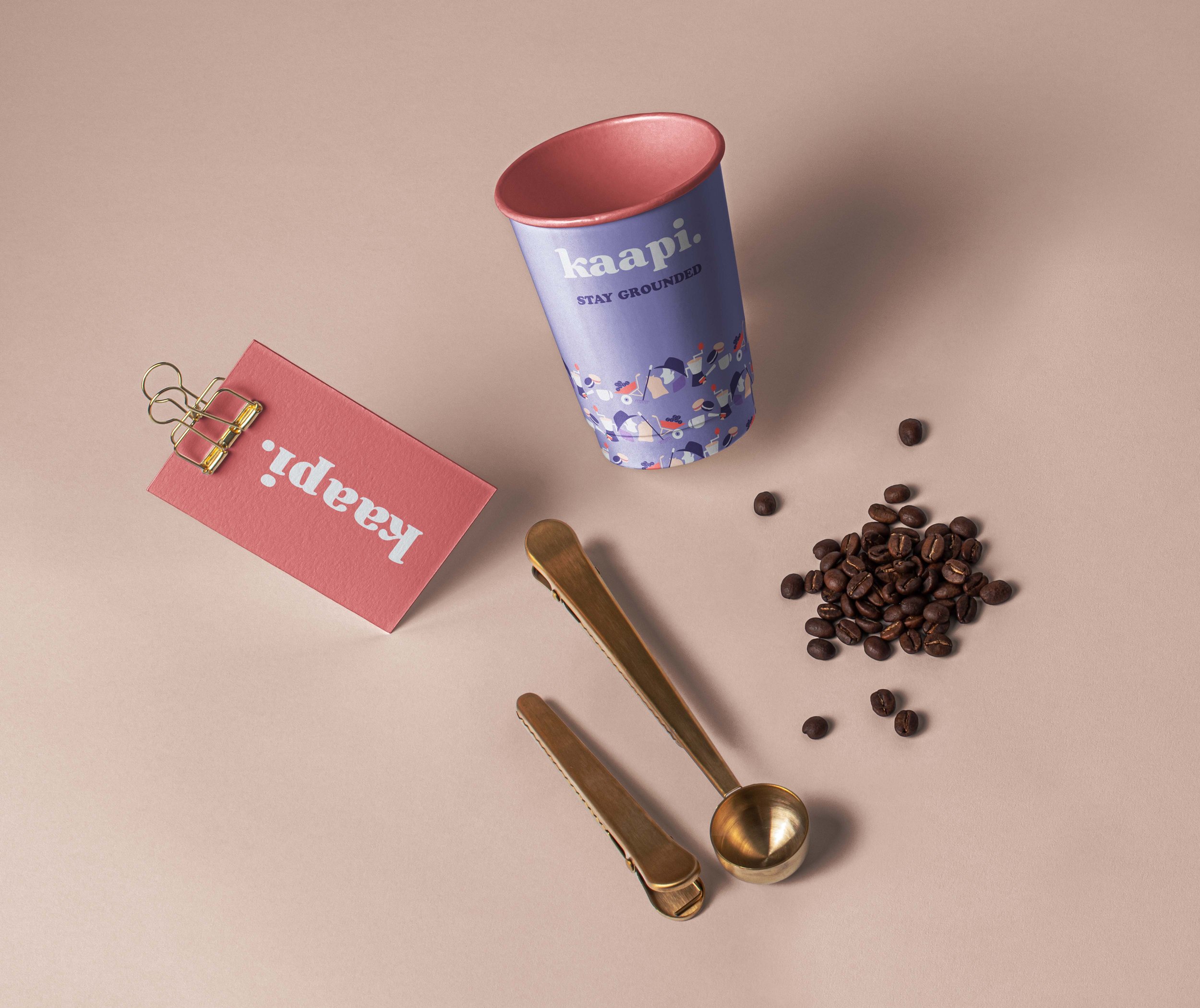
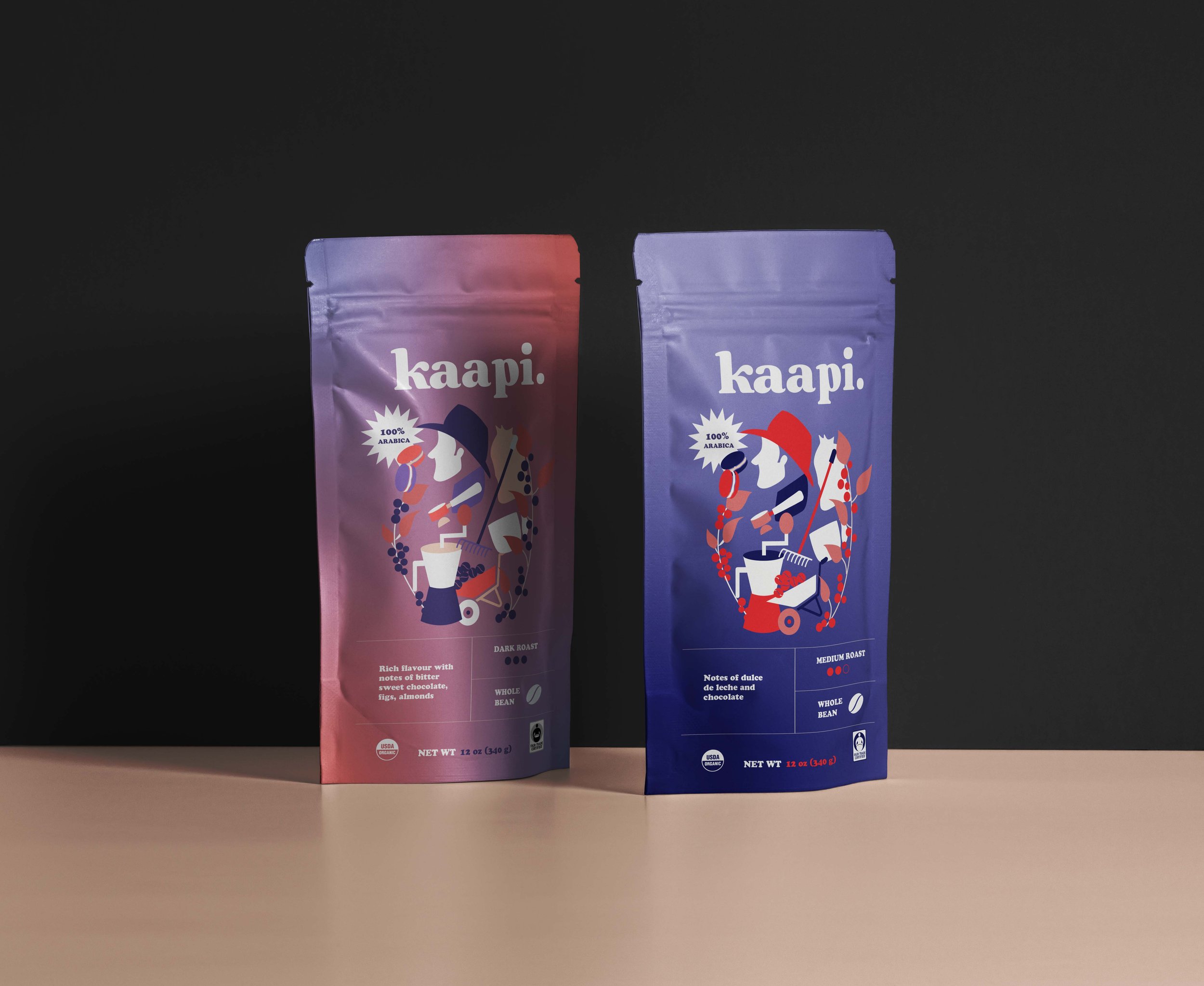
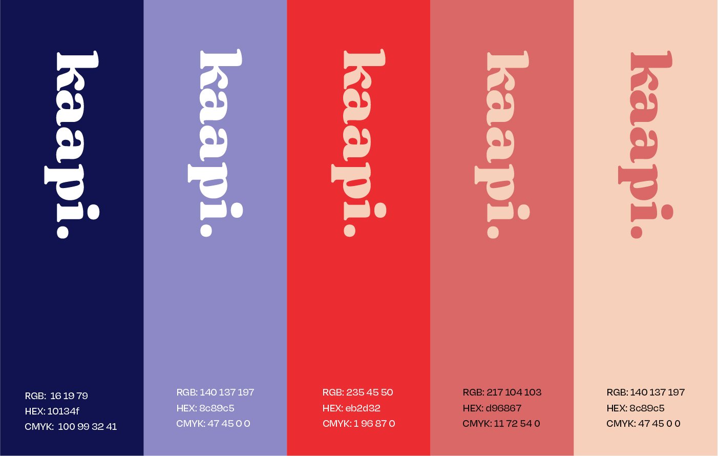


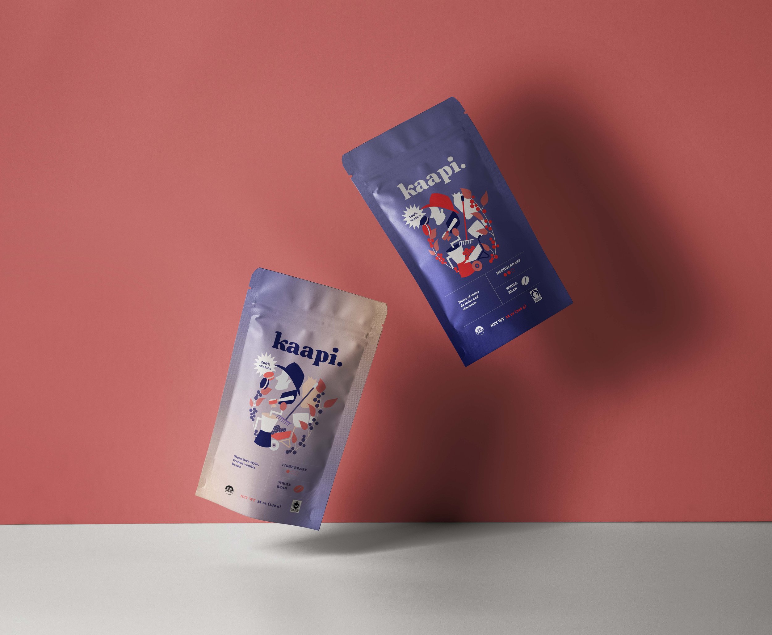
To communicate the brand's personality, I put emphasis on creating colourful, collage like illustrations and bold typefaces together. This helped in reflecting the target audience and highlight the brand ethos.
The colourful packaging allows for equal parts boldness and fun, making it fly off the shelves.